

Why I Built Nowflation.com
The full story behind the site: the problem that pushed me to build it, what it actually does, and how the engine under the hood works.

The 20-tab problem
Every weekday morning I host a Mid-Day Stock Market analysis stream at 11:30 AM Eastern and the prep starts hours before that. A significant part of my analysis focuses on different economic indicators and I would open Fred to pull the latest CPI series, look at the EIA site to see what is happening with energy, check AAA for gas prices, look at Zillow’s research for rents, open the Cleveland Fed for their inflation nowcast then check Kalshi to see where prediction markets had the next print. If that wasn’t enough I would look at the Treasury site for yields, have the BLS calendar open to see what’s dropping this week while having the Atlanta Fed open for their GDPNow data. Some mornings I would have 15-20 tabs open trying to make sense of the economic indicators before I finished my coffee.
The part that always annoyed me was that the actual CPI print was describing a month that ended six weeks ago. The rent data was on one lag, the gas data on another, the used-car data on a third. I was the aggregation layer manually trying to figure out what the actual landscape was. At some point the question stopped being how do I make this routine faster and became why doesn’t the thing I actually want exist. What I wanted was simple to describe and apparently impossible to find: one place where the economic data lives, current as of this morning, cross-referenced, with a single honest headline number for what inflation is doing right now. Not last month. Not the month before that. Now.
So I built it. It’s called Nowflation.com, it’s completely free, and this is the full story of why it exists and how it works.
The problem with the official number
Let me be clear up front: this isn’t a hit piece on the Bureau of Labor Statistics. The CPI is a serious, rigorous statistical product, and it’s the authoritative historical record of US consumer prices. Nowflation is measured against it, not pretending to replace it. In my opinion, the CPI has a structural feature that makes it nearly useless for the question I care about, and that feature is time.
Walk through the calendar with me. The June CPI report comes out on July 14th. The prices in that report were collected throughout June so on the day it prints the newest data point in it is already two weeks old and the oldest is six weeks old. Then we all sit around until mid-August for the next one. If something changes in the economy on July 15th the official record won't fully reflect it until September. In a world where gasoline reprices daily and rents reprice with every new lease that's driving by looking at a photograph of the road from last month.
Shelter makes it worse, and shelter is roughly a third of the index. The BLS measures rent by surveying a rotating panel of existing units and each unit only gets sampled about twice a year. Most tenants aren't signing a new lease in any given month so a lease signed today filters into the official shelter number over quarters not weeks. New-lease rent indexes from sources like Zillow and Apartment List lead the official shelter series by roughly a year. We all watched this play out in real time as market rents rolled over hard and official shelter kept printing hot month after month which dragged headline CPI along with it. Anyone watching new-lease data knew disinflation was coming long before the official number admitted it and anyone who only watched the CPI print was a year behind what was actually happening in the economy.
None of this is a conspiracy but rather a methodology. The CPI answers a specific question: what did the average urban household experience across the survey window? That's a legitimate question and the BLS answers it carefully. My question is different: what do prices look like today for the person signing the lease, filling the tank, and pushing the cart? Very few places were answering that question in one place for free every day and aggregating all of the different economic data which was the gap.
So I went and got every API I could
The build started the way most of my builds start and I started with a data audit. I sat down and mapped every public source of US price and macro data I could get programmatic access to. I began with a FRED API key, then direct feeds from the BLS, the BEA, and the Treasury. Then I added the EIA for energy, the USDA for food, and Zillow's research files and Apartment List for new-lease rents. I am using AAA for daily pump prices and Manheim for wholesale used-vehicle auctions. I even added in Kalshi for prediction-market odds on the actual prints. I added source after source and key after key until the pipeline covered the entire consumer basket and most of the macro picture around it. I published on nowflation.com every place where the data is being pulled in from to be as transparent as I can be.
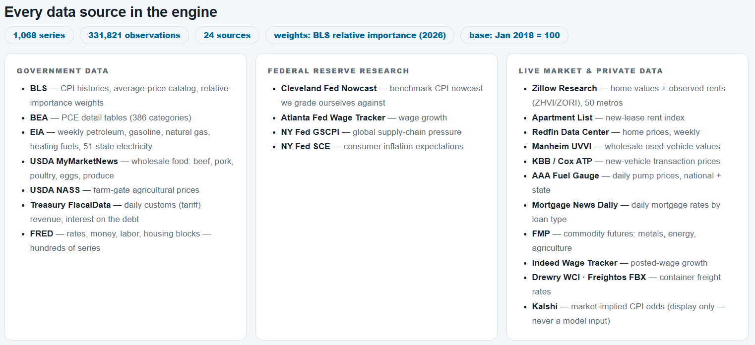
Today the engine ingests 1,068 public series from 24 sources, more than 331,000 observations and counting which all flow into one database. Every observation gets stamped with the date it arrived and that little timestamp turns out to matter enormously which I will discuss when I talk about backtesting. This was a deliberate choice from day one because just about everything is public data. I believe that nowflation.com doesn’t create an edge from magical secret data. I believe that the edge is it’s breadth, speed, transparency, and a willingness to be graded in public. Every number on the site traces back to a source you could go pull yourself. All I did was save you the time of having 15-20 tabs open and aggregated all of the data into once place.
What Nowflation actually is
Strip away all the pages and the site is three products sitting on one pipeline.
The first is the Nowflation Gauge which is a daily CPI-comparable inflation index. As I write this on the morning of July 9, the gauge reads 1.78% year over year. The official CPI for the month of May read 4.2%. That gap of 2.42 percentage points is the whole reason the site exists and I’ll spend a full section below on what it means and why the two numbers disagree.
The second is the Nowflation Forecast which is a call on the next official print. This is published before the release and never touched afterward. Right now the model has June CPI tracking at 4.025% year over year against a Street consensus of 3.9%.
The third is the Scoreboard, where I grade that forecast in public after every single print, side by side with the Cleveland Fed, the Wall Street consensus, and the Kalshi prediction markets. Anyone can put a number on the internet. The scoreboard is what separates a forecast from a guess.
In addition to the Nowflation Gauge, Forecast and Scorecard I wanted to build a site based on how I wanted to view the data. I built a full macro hub that includes GDP nowcasts, labor, housing, money and credit, rates, the fiscal picture, recession odds, state and metro pages, country pages, and a long list of single-item trackers.
Where the numbers come from
Every component of the gauge is fed by the fastest credible public source I could find for it.
Motor fuel comes from daily national pump prices backed by EIA data and a forward model built off futures. As I write this, the national average sits at $3.796 a gallon, and the two-week forward read has it at $3.797, basically flat.
Shelter which is the biggest and most important piece, comes from new-lease rent data from Zillow and Apartment List. This data leads the official series by roughly a year in addition to utilizing home prices and mortgage rates for the ownership side.
I am using Manheim's wholesale auction data for used vehicles which historically front-runs the official used-car index by a couple of months.
Food at home is built from USDA and BLS shelf-price data item by item.
Energy beyond the pump which is electricity and utility gas is being pulled from the EIA.
The broad macro spine and the official series everything gets benchmarked against comes from FRED plus direct BLS, BEA, and Treasury feeds.
Kalshi's markets give me a live read on where real-money traders think the prints land which rounds out the pipeline.
Nowflation is built in the open from many different public sources courtesy of Uncle Sam.
How the gauge engine actually works
This is the part I get asked about most, so let me open the hood properly. The gauge is built on the CPI's own architecture. I take the basket and organize it into 14 components which includes:
shelter rent
shelter owned
motor fuel
used vehicles
new vehicles
food at home
food away from home
electricity
utility gas
medical care
apparel
recreation
education and communication
a residual for everything else.
Each component carries its published CPI relative-importance weight so the basket math mirrors the official construction. The index is anchored to a base period of January 2018 equals 100 which also produces one of my favorite stats on the site: cumulative prices are up 33.9% since January 2018.
Then comes the core idea which is the thing that makes it nowflation instead of just a re-plot of the CPI. Each component rides the official series through history and then at the front edge wherever a faster market-price source exists the live data takes over. Fuel reprices every single day from pump prices. Rents update monthly from new-lease data which means my shelter component turns when the market turns instead of four quarters later. Where no faster source exists yet the component honestly carries forward at its latest official reading until the next print.
I want to stress that last part since it's the difference between an honest daily index and a fake one. On a typical day the movement in the gauge is mostly fuel plus whatever the latest monthly rent update did. I'm not pretending to have a real-time feed on medical care prices and the reality is that almost nobody does. What I have is a framework where every component updates at the fastest honest frequency available for it and where the daily attribution tells you exactly what moved. Take a recent daily read where the gauge ticked up about half a basis point, it was motor fuel that contributed essentially all of the increase. That's written right on the page in plain English every morning.
There is another design decision that I want to explain because the gauge ships in two shelter variants and they answer two different questions. The CPI-comparable variant uses rental equivalence, the same conceptual approach the BLS uses just without the survey lag. That's the number you compare against the official CPI and it reads 1.78% today. The Cost-of-Living variant prices ownership the way an actual buyer experiences it which is house price times the current mortgage rate. That's the marginal buyer's reality and it reads 1.70% today. When rates are moving those two views of shelter can tell very different stories and I’d rather show you both than pick one and hide the other.
The headline gauge doesn't travel alone, it ships alongside companion reads for core CPI, supercore services excluding shelter, PCE, and core PCE which is the measure the Fed actually targets. The core CPI forecast for the June print sits at 2.87% against the official 2.9% from May and core PCE tracks at 3.4% against 3.41%. Right on top of the official numbers where the lags are small and far away from them where the lags are large. That's exactly the pattern you'd expect if the methodology is doing its job.
Why my number and the official number disagree
So: 1.78% versus 4.2%. A 2.42-point gap is enormous and I want to be very precise about what it does and doesn't mean.
It does not mean the BLS is lying and it does not mean inflation is really 1.78% in some cosmic sense. The two numbers are measuring different windows of time with different shelter clocks. The official 4.2% describes May weighted toward leases signed over the past couple of years. My 1.78% describes today weighted toward leases being signed right now.
If you look at the component detail the gap explains itself. On rent, the official series has 2.9% year over year. My new-lease-based measure has 0.8%. On utility gas, the official read says up 3.0% while current market data says down 5.6%. Meanwhile, on electricity I'm actually above the official number, 8.4% versus 5.9%, so this isn't a machine built to print a lower figure. It prints what market prices say in whichever direction they point.
Here's how I'd translate the gap: the pipeline is cooler than the record. Market prices today are running well below what the trailing official record shows which historically means the official prints have room to come down as the lagged components catch up to reality. The gauge led on the way up in 2021 and 2022 when anyone watching new leases could see the official number was about to run hot. It leads on the way down too.
Now the honest nuance which matters. That 4.2% May print was up from 3.8% and is the hottest official CPI reading since April 2023. My forecast for the very next print for June which will be reported on July 14th is 4.025% which slightly above the 3.9% consensus. How does a warm near-term forecast square with a 1.78% gauge? Easily once you separate the two products. The forecast is arithmetic about one specific report : what's already baked into June's collection window, base effects and all. The gauge is a statement about where prices are today. In the near term the model says the June print comes in warm. Beyond that the gauge says the direction will trend lower. Holding both of those at once isn't a contradiction. It's the entire point of having both tools.
The forecast, and why I publish a blend instead of my ego
The in-house nowcast model does exactly what you’d expect as it takes everything in the pipeline, the daily fuel data, the rent trajectory, the component carry-forwards, the seasonal factors, and produces a call for the upcoming print. Right now it thinks June runs a touch warmer than consensus and I publish that transparently. I don't nudge my model toward the crowd so I can look smarter after the fact.
The number that I actually put on the tape as the headline forecast isn't my raw model. It's an ensemble which is an inverse-error-weighted blend of the forecasters who've earned a real, graded track record. The mechanics are simple and a little ruthless as each forecaster's weight is 1 divided by its own historical error so more accurate forecasters count for more and the weights recompute themselves after every print grades. Nobody gets grandfathered in and a source like Kalshi stays display-only until it accrues enough graded prints to earn a seat so the headline never leans on a forecaster with no evidence behind it.
Grading myself in public, and never rewriting the record
This is the section I care about most because the financial internet is full of people making calls and quietly forgetting the ones that missed. I built Nowflation to make that impossible for me where three mechanisms do the work.
First is the backtest. When I test how the model would have done historically, the engine replays each past print seeing only the data that existed the day before that print. Later revisions are hidden and the future data is hidden. That's the real reason every observation gets stamped with its arrival date: so the backtest can honestly reconstruct what was knowable at the time, with zero look-ahead. A backtest that peeks isn't a test it’s a marketing document.
Second, the scoreboard is live and automatic. On print mornings the system captures the official number the moment it drops and grades every forecaster against it. The public leaderboard shows each forecaster's average error, its bias, and its win count, mine included. Nowflation is graded against the Cleveland Fed, the Street, and Kalshi. When Nowflation misses, the miss goes on the board and it stays there.
Third, every forecast gets frozen before the print into a dated timestamped receipt committed to the site's code repository. The locked timestamp, the scheduled release time, and every forecaster's number is collected and published and cannot be edited afterward. The same discipline applies to the gauge's own history: values are stored and never silently revised. When the methodology changes, and it will, since this is a living project, the change ships in a dated public changelog. You will never load the site and discover that the past has been improved.
The engineering: one machine and a lot of guardrails
People sometimes assume there’s a team behind this but there isn’t. The engine runs on a Mac mini sitting on my desk, Node.js and a SQLite database, chewing through 24 sources every morning before the market opens.
What the public touches is a static site rebuilt each morning and pushed to a global CDN. That's why every page loads in under a second and it’s why a hiccup on my end can’t take the site down. The engine and the site are decoupled on purpose. The publish itself has to earn its way out the door every morning. Before anything deploys the system runs a self-test with a dozen checks, six of which can block the entire publish on their own. Every series carries a day-over-day sanity guardrail so one bad API response can’t poison the index. I built a drift guard on the outputs themselves: if the gauge moved more than three quarters of a point in a day, or the forecast more than half a point, the deploy gets blocked, the last good version of the site stays live, and my phone lights up. Bad data cannot quietly reach the air.
You don't have to take my word for the pipeline's health, either. There's a public status page showing the live self-test, the freshness of every single source, and publish health. The observability is itself part of the trust. If something's stale you can see that it’s stale.
What Nowflation is not
Nowflation is not the official number and it’s not trying to be. The CPI remains the authoritative record. The gauge is benchmarked against it, leads it, argues with it, and never overrules it.
It's not a magic tick-by-tick feed of the whole basket. Day to day, the honest movement is fuel plus the monthly rent update with the slower components carried forward from the last print. A few overlays like the Manheim used-car splice are still warming up while they accrue enough clean history, and until then they fall back to carry-forward.
It’s not a black box. The methodology page lists every series, every source, and every weight, all 1,068 series across all 24 sources, and every one of them is public.
For now it runs on one machine in my home. That's a single point of failure which I am honest about and I’m actively hardening it. The static architecture insulates you from it, but the engine is the engine.
The other half of the reason: one place for my community
Everything above is the analytical case. Here’s the personal one. I didn’t build this just so my own mornings would be easier. I built it so the people in my community would have one place to go. For years, the answer to where do I check this stuff was a list of nine government websites and a shrug. Now it’s one URL, nowflation.com.
The site has grown well past the gauge as it now includes:
A heat check that scores the whole economy on a heating-versus-cooling scale.
A page that compares my numbers to the BLS line by line.
A personal inflation calculator where you re-weight the basket to your own life, your rent, your commute, your grocery cart, and get your inflation rate instead of the average one.
A GDP nowcast
Jobs and labor pages
Housing and affordability
Money and credit, rates
The fiscal picture
Recession odds
State pages
Metro pages
Country pages for more than 200 economies
Single-item trackers: eggs, gas, coffee, milk, bread, bacon, ground beef, chicken, etc
All in, it’s more than 60 pages plus a long programmatic tail which is organized so you can get from the headline to the detail in two clicks. Everything is also free with no paywall, no login, no unlock-the-last-30-days gate. There are free CSV downloads on the data pages, an open API, and embeddable widgets so you can drop any chart onto your own site. The robots file even welcomes AI crawlers on purpose: when someone asks an AI assistant what inflation is doing today, I want the answer to be citable, sourced, and current.
The whole thing updates every morning before the open with today’s read written straight from the data: what moved, by how much, and why. One page instead of 20 tabs. That was the mission statement the entire time.
Kick the tires
Here’s how I’d suggest you use it. Check the gauge against the official number and watch the gap. Read the daily attribution so you know what’s actually moving instead of guessing. Before a print, look at the forecast and where it sits against the Street and Kalshi. After the print, go straight to the scoreboard and see who was right, me included.
June CPI drops on July 14. My number is already locked, timestamped, and sitting on the board at 4.025% against a 3.9% consensus. Whatever happens, the grade goes up in public, right next to everyone else’s.
That’s Nowflation. Built out of one guy’s frustration with 20 browser tabs, running on a small computer with strict rules, graded in the open, and free on purpose. Come see what the data says today: nowflation.com.
Will take a look at the tool, overall it's sounds like a great idea.
Looks good